180 The Strand
The identity for 180 The Strand draws from the building’s brutalist architecture, anchored by a semi-circular mark that references ‘180’. Designed for a space in constant flux, the system is flexible-logos, color, and layout adapt to context, allowing the brand to respond to each exhibition without losing cohesion. Primary marks provide consistency, while the flexible logo is reserved for expressive applications.
Capacities
Concept Development, Typography Design, Graphic Design, Visual Identity


Poster Design
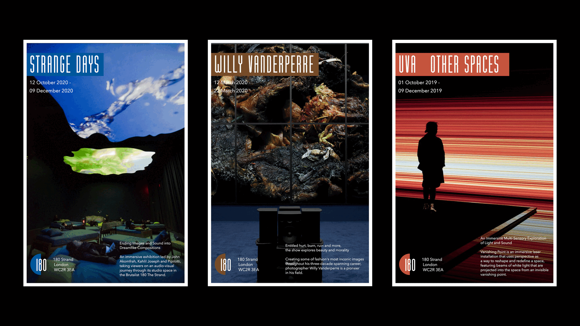
The poster layout uses a visual guide system to ensure consistency across all promotional materials. To simplify the process of creating these assets, I developed a web-based design tool using the p5.js